07.11.2015
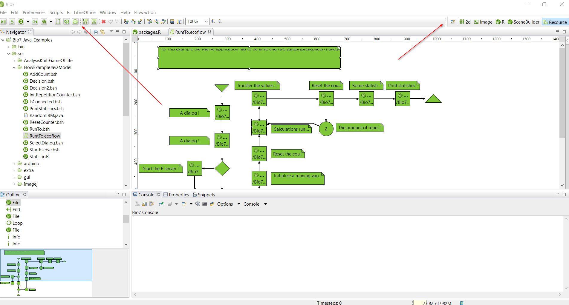
Finally I was able to find the CSS error in the toolbar layout which resulted in a visible gap when, e.g., the Flow editor was active. Now everything looks much better (see the red arrows!) especially when you install Eclipse plugins which make contributions to the main toolbar.
You can also add this corrections easily to a current Bio7 2.3 installation. Just add the following lines to the default Bio7 CSS (Path: Bio7/plugins/com.eco.bio7.themes_2.0.0.201508261732/css/e4_default_yourOperatingSystem.css):
.MToolBar.Draggable {
handle-image: url(./dragHandle.png);
}
.MToolControl.TrimStack {
handle-image: url(./dragHandle.png);
}
.MToolControl.Draggable {
handle-image: url(./dragHandle.png);
}
And delete the following ‘handle-image’ line in the Perspective Switch attribute:
/*Perspective Switch!*/
#org-eclipse-ui-main-toolbar #PerspectiveSwitcher {
……..
………
handle-image: none;
Or just copy over the CSS from the default_win7.css github file.
